
- You are here:
- Home

- Kate Aubrey's Art Blog
- Yes! The Sunflower Revisited
- Details

I am delighted to announce that my painting, “First Fiddle” has been accepted into the National Watercolor Society’s 104th International Open Exhibition. This has been a dream of mine for more years than I want to say, and I am beyond honored.
Thank you to the wonderfully knowledgeable and hard-working people who make this one of the premiere watermedia shows in the USA! You have been kind, encouraging, and so helpful during the process. I just wish I could jump up and down in circles with you!
- Details
Welcome!
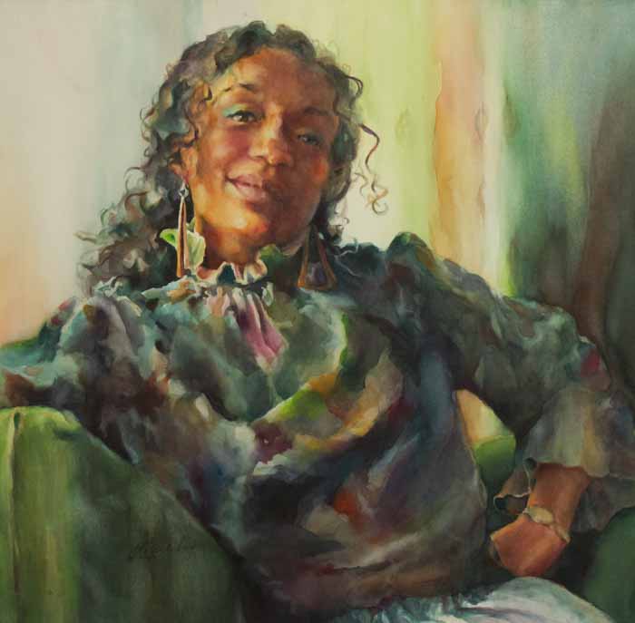
Thanks for checking out my “new” website. This has been a year of big changes for all of us, I think, and my website was part of that. Numerous and rapid tech changes left it in the dust a while back, so it’s really a pleasure to be able to get in and post and enjoy all the work my wonderful webmaster has done. Thank you, Kara at B4 Studio!
Changes. I’m not sure how many of them people can actually see in me, but from the inside the changes are huge. They are the kind I see in my paintings more than anywhere else. They’re the kind that take place in the heart. I can’t help but reflect them in paint.
Those of you who have visited before know that I’ve pared down dramatically. Almost all of my paintings are of people, now, and have been for well over a year. It was a business decision at first, so of course I had resisted it for, well, forever. You hear it throughout the painting world: paint what you love. And I love everything. Animals, flowers, trees, mountains, rusty hinges on old doors, the sun shining through dust motes onto a wooden floor, I love them all.
Most of all, though, I love people, so when my husband and some incredible painters told me — again — to concentrate on just one subject type, I chose people. They’ve been my greatest love affair since I was a child.
My experience painting in series, especially my two 30-day Apple series had already taught me that my husband was right. Painting in series is, for my money, the single fastest, clearest, and least expensive teacher there is. My painting skills have increased exponentially since I made that choice.
What I didn’t realize was how deeply it would affect my inner life and my peace of mind. Painting people, you see, has taken me more deeply into my heart than any other subject would have. I’ve seen things there that take me aback, things that embarrass me, things that lift me up, that give me joy, all because I’ve looked other people in the eye and, over and over, painted what I’ve seen.
So in this new and unpredictable time, artists, look within. And by all means, paint what you love.
Hugs.
- Details
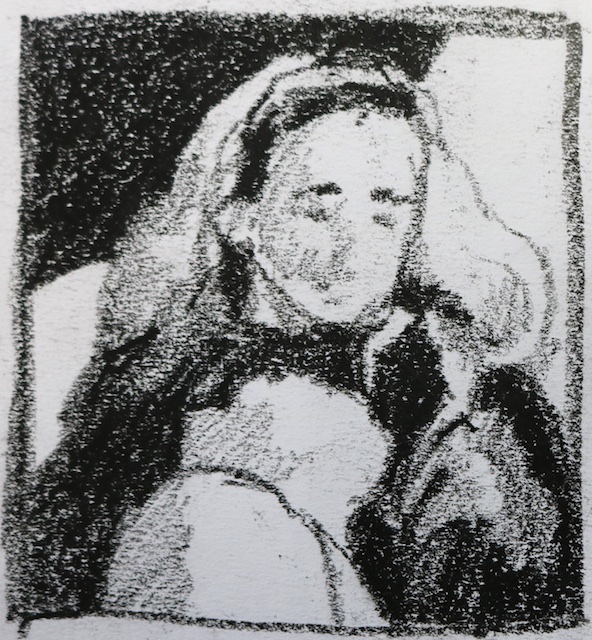
For the longest time, I resisted doing 3-value thumbnails. Oh, I did “thumbnails”, don’t get me wrong. But black, white and only one medium gray? No, no, no. Surely you jest. There had to be shading in there; maybe not as much as in a value sketch, but at least three or four grays. And doing those sketches helped. I discovered all kinds of things about what I would be painting and even solved a few problems. The thing was, they took too long, and it was really hard to find cool, alternate compositions. Designs in other people’s thumbnails just snapped into place. Their tiny, 2 x 3” sketches could drag me across the room wanting to see more.
Not mine. Why?
Because what I was actually creating were value studies, not thumbnails. “OK,” I said when the light finally dawned. “I’ve got to cut it down; I’ll do black, white, and just two grays—a light and a dark grey without much detail.” Things improved. Each thumbnail took a fraction of the time and, tentatively, the big, abstract shapes began to peek through at me. Cool. Now I just needed to practice.
But I didn’t. Practice, that is.
At least, not enough. Certainly, no thumbnail habit developed. Plus, I still had Thumbnail Envy. Other people’s little gems had better, tighter design and more pull-me-across-the-room impact in roughly half the drawing time I was spending. Sometime during the two-plus years after taking John Salminen’s incredible breakthrough-inducing abstract workshop, how I see and interpret things has changed. One morning, someone in my Thursday painting group mentioned doing another 30-day challenge, and everything snapped into place: Three-Value Thumbnails. Thirty of ‘em. I could see how to do them and why. Paradigm shift!
Black. White. Medium gray. Absolutely minimal detail—can you see how much more exciting the thumbnail above would be if I had left out the ripples in the mid-ground water? For the first time, I know at first glance whether I’ve got a real keeper.
Try it. It’s not just worth the time; it’s exciting and enormously satisfying.
See you next week.
- Details
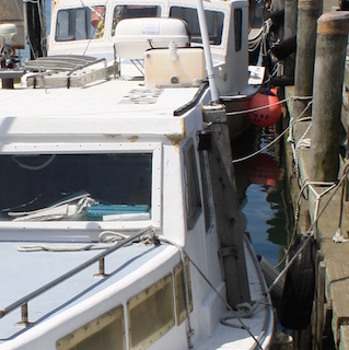
As my 30 days of thumbnails wind to a close, I can’t shake the feeling that I’ve only scratched the surface of what they will teach me. The more of them I do, the more I will learn. Take today’s photo of the dock scene on the index page for my blogs as an example. I love the colorful fishing buoys you can find in any harbor on Cape Cod, especially the red ones, so you can see why I’ve been stuck on this Woods Hole scene. It’s complex, though, and I didn’t grow up on the water, so I put it off…until the Great Thumbnail Challenge.
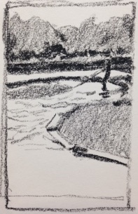
First off, I cropped it, and recorded it, and cropped it again until I found this vertical format full of great shapes. And, of course, the red buoy. In this first thumbnail, I’ve discovered several things:
- The shapes of the pilings in the upper right corner are way more important than I’ve made them.
- Two mooring ropes may be plenty.
- Bright sky reflections in water are not always light values. Hey. It was water. And sky, you know? So I left them white at first Because I Just Assumed they were light values. And the composition shattered and scattered into chaos right there in the thumbnail. Instant feedback. I figured out the problem real fast and made them a medium value. Voilá! Instant improvement. If I had made that mistake with paint, I don’t know how long it would have taken to figure it out.
- In black and white, my red buoy does Not stand out as the focal point. Because—you guessed it—even the sunlit portion of the red buoy Is Not A Light Value! It’s medium gray against black, so you don’t even really see that wonderful round shape up there amidst all the angles and lines.
That’s a lot to learn from one thumbnail, and I’m not even done yet. In my next Red Buoy Thumbnail I will have to figure out how to adjust the values so that the pilings lead the eye down to the buoy, and the round buoy becomes The Focal Point. Once I have a Wow! thumbnail, I can use it to tell me how light or dark to paint things, and I will (God willing and the creek don’t rise) have a Wow! painting.
Everyone in our 30-day Thumbnail Challenge is glad they took it on. So give those 3-value thumbnails a try, and start saying, “Wow!”.
- Details
I've become addicted to online challenges. They keep me honest. I say I'm going to do something, like post a new Apple painting every day for thirty days, and I actually do it. Why?
Because You Are Watching.
That's it; it's that simple. If I don't post, you notice. Since letting people down hits about six dozen childhood hot buttons, I pull myself together at some point each day and climb the studio steps and get it done. Hey. It works for me. A daily post can get kind of old for the receivers after three or four challenges, though, so this is me taking a deep breath and committing to an ongoing, weekly blog. This month it's all about Thumbnails because--you guessed it--that's my current 30-day challenge. Some of my fellow Thursday Painters are joining me, and we're texting our results to each other. (Yup. To keep me honest.)
Thumbnails are those little 3- to 4-value studies that a lot of really great artists do of their next painting before their brush ever touches the canvas or, in my case, the paper. They are a phenomenal tool, helping you solve all kinds of problems ahead of time so your composition really sings. They take five to ten minutes. On top of that, the process can yield several absolutely excellent, exciting designs for the same subject if you care to take a bit more time. I dearly wish I could remember which Big Workshop Artist said it was her favorite part of the entire painting process.
So it's fast; it's exciting; it teaches you to see abstract shapes and use them well...and very few intermediate or advanced artists do them regularly. Including yours truly. Hence the challenge. Here are the "rules" I'm going by:
- Mine are no larger than 4" on a side, and smaller is better, say 2" or 3".
- The goal is Not a value study.
- The goal is to find and arrange the big, main shapes in my painting-to-be, so I'm only using three values: black, white, and medium gray.
- Detail is death here. It will lure me onto the path called a value study, which only leads back to my comfortable, old habits. Habits teach me nothing.
- If it's taking me longer than 10 minutes, it's becoming a value study. Stop that.
I hope you give it a try. See you next Monday.
