I’m not sure what happened, but one day after decades of painting other people, I woke up wanting to paint…myself. In my rule book, paintings may only come from my own material, so I stuck my camera on the tripod, went into the bathroom where the notion had hit me over the head as I looked into the mirror that morning, and took a bunch of photos of myself (and the camera) using the camera’s timer. I came up with a couple of poses that I liked. This is the first one.
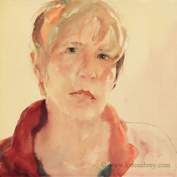
As usual, I laid out the drawing after deciding on a square painting format, then applied my first flesh-tone wash. One unusual thing about this is that I didn’t take the flesh tones out into the background, although I did bring them up into the hair. This should have been a little pink flag telling me that I was holding back. I was treating the background like I used to many years ago when I didn’t know how to do them well, but I didn’t think about that at the time. Now I realize something silly: I was nervous.
At the time, though, I just plunged into painting the eyes once it was dry, as usual, then some hair strokes using cadmiums mixed with my green. Then the second unusual thing happened. I moved down to the jacket and direct-painted one entire shoulder and the blouse. Direct-painting is a term I use for plunging in with rich, intense, dark colors wet-on-dry, then let additional colors melt into those. My aim is to complete the entire shape (or object) in one application. I find myself doing this more and more, almost first thing in a new piece. Because it’s different (and therefor a challenge), the paints do great things, including lifting more easily for highlights. It also lets me “lock in” the emotional aspect I’m shooting for so I don’t forget. And It’s Fun.
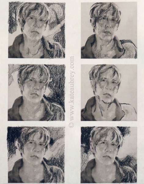
At that point, reality caught up with me. I didn’t have a composition in mind at all except for the basic triangular shape so ubiquitous to portraits. How silly of me. I seldom let that happen anymore. So it was off to the drawing table with a set of black and white thumbnail photos of the painting on printer paper to play with different ideas. I used a black grease pencil (a china marker works, or a black crayon).
And I certainly did play. With lines and shapes, high key and low key, curves and angles, simple and complex. Being me, I chose the complex. I knew I might have to tweak the composition in the lower right corner some more, but it felt both exciting and moody, which was what I was feeling inside.
I taped this sheet up on my painting board so I could see it easily and got to work. It’s important to make it easy to see because people, myself included, usually forget to look at their plan once they have one and so paint themselves even further into a corner.
Kate’s Compositional Rules
1. Remember to plan.
2. Actually look at the plan as you paint. Constantly.
At last! A plan! Confident now, I put down my yellows wet-on-dry first, softening edges or melting in oranges and greens as I went. That layer moved from middle value through to light, then white paper.
The pops of orange and red were placed mainly by paying attention to my gut feelings plus whether they would balance the existing warms compositionally. I put them where my hand and arm told me it felt right, with maybe 5% of the decision being made in my head. It sounds weird, but it’s true.
While all that was still damp but without a sheen, I came back in with deep, mixed darks, most warm, some cool. I wanted a basically warm painting with less than a third of it painted in cool colors. So far, so Good. There were plenty of good, strong darks to compare the rest of the painting with. It was time to go to work on the figure in earnest.
I finished up the features and the rightmost shoulder in three layers of glazing, each glaze applied after the preceding glaze was completely dry. I chose red, green, and ultramarine blue as my main triad because two of the three colors I used are either partially or heavily sedimentary (opaque) when heavily applied. That means they run together on the paper in ways that make wonderfully soft fabrics and surfaces, and they lift back beautifully when needed. Ultramarine blue is also a great color for the shadows in hair, eyelashes, and Caucasian skin tones. On top of that, green and reds/oranges make beautiful browns and earth tones, which I needed for the hair.
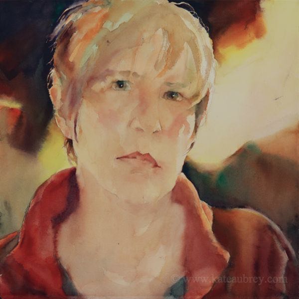
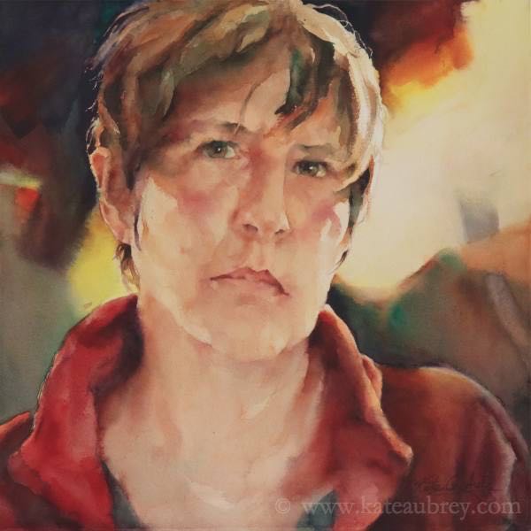
Once I got her…er, me…pretty well finished, that big light shape over the rightmost shoulder bothered me. It was too big, too regular, and too…well…boring. Since that side was short on squared-off brushmarks, I decided to put a greyish one in as a counterbalance. Then I lifted the granular dried paint up below the orangey mark to give the mark a 3D effect and a downward pull. Was I done?
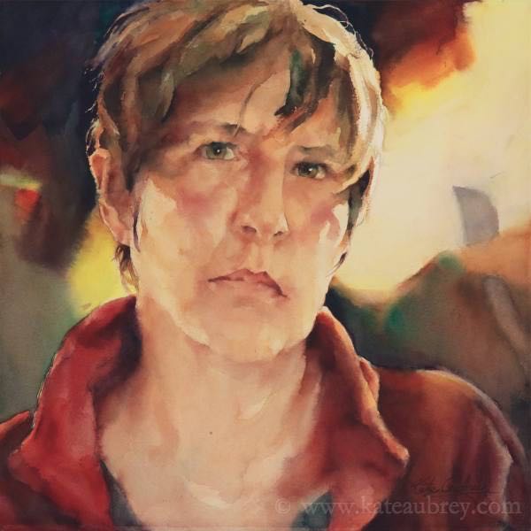
No. Not quite. Although I only made one change to this painting before taking this final shot of the finished piece, it was an important change.
Go back to the previous image and look at the last squared-off brushmark I told you about. Now back off and just look at the whole painting in that previous image. Rotate it, look at it in a mirror or through a reducing glass. Do you see how you keep wanting to look at the rightmost eye, skipping over occasionally to the grey, squared-off mark? It feels a little uncomfortable when I look at it for too long, like I should be looking somewhere else (because I should). But I keep going back to that eye. I’m stuck. So after less than a minute, I’m ready to walk away and find another cool painting to look at.
Any way you look at it, that’s not good. It means your composition is off. What’s doing it? It’s that squared grey mark. It’s hard-edged in a background of soft. And it’s isolated, sticking up too far into the only large, nearly white space in the painting. So I made it blend in. It didn’t take much, just a softening of the upper edge as I removed some of the height. No problem with the granular paints I chose. Now when you look at the painting, the center of interest is the leftmost eye, not the right. For the first time, I also see all kinds of delightful marks and colors elsewhere in the painting that I didn’t see before because I’m no longer stuck on the wrong eye.
This is what I mean when I talk about balance. At the end of a painting, it’s usually accomplished with one simple and fairly small change like this.
So. What’s my next challenge? Not being so darned careful the next time I paint a portrait of myself!
Main Near-Triad:
Cadmium red (Quiller brand)
Richeson green (Quiller)
Ultramarine blue (Quiller)
Along with:
Cadmium yellow light (M. Graham)
Permanent orange (Quiller)
Cadmium red light (Quiller)
Quinacridone rose ( M. Graham)
