• California Watercolor Association 2018 Silver Medal
• Watercolor Society of Alabama 2019 Award of Excellence (Best of Show)
People often ask me how I paint things like steam and fog. They make amazing subjects, adding mood and beckoning the viewer to let go of what is and allow what might be. Painter or viewer, it doesn’t matter. In a word, they are fun.
There are a few things to remember when painting smoke and its relatives. First, remember that it is real; it contains water droplets and tiny particulates which cast shadows and add color. Second, those molecules and particles block the view. Third, it is almost never the center of interest; it’s too diffuse to draw the eye, so don’t overdo.
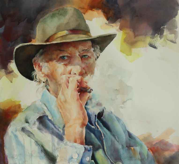
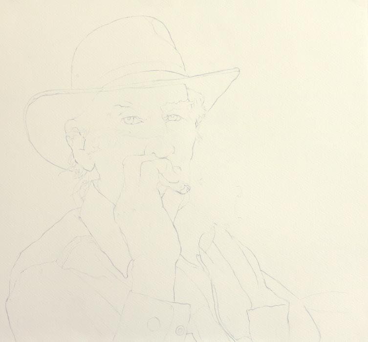
Here is a wonderful man, the father of a dear friend, who sat for me with one of his favorite things: a cigar. (Don’t criticize. He lived well into his 90s after smoking at least one every day—outdoors. Even after his wife died.)
The important thing here is that you notice where the lines of his face, shirt, and hand stop. If you can’t see a line for all the smoke (or fog), Don’t Put One In.
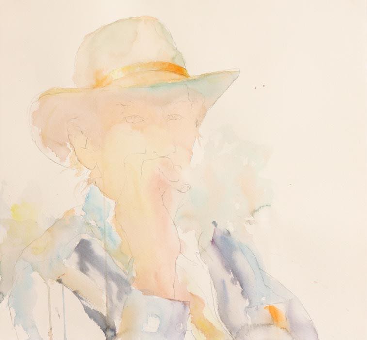
As usual, I started with my first, very light wash of cadmiums and pthalo blue over the figure and extending into the clothing and background. This wash took about seven minutes, so I was moving fast and letting the watercolor do its thing. Notice that I used the same near-complementary base colors in the smoke, leaving irregular white spaces within it, and fuzzing the edges in places. I encouraged it to bleed right down into the shirt. As the upper portions dried, I continued on down through the shirt and hand.
Once I had a thin wash over everything I wanted to cover, I added quinacridone magenta to my colors-in-use and went back into the shirt, then the hatband to add some detail. Notice that the first wash was still wet, but the shine was definitely off the paper, more so in some places than in others. I was able to get some fairly hard lines along the shirt’s shoulder seam and collar edge but the blues still melted nicely elsewhere. The only way I know of to learn how to do this is to try it over and over again in your paintings until you learn what the fine nuances of surface dryness and brush wetness are. Sorry, in watercolor there are no magic bullets…except maybe this: The more you paint, the better you get.
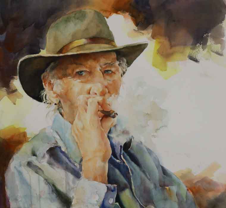
At this point, I’d done some interesting things to the painting, and I had a lot on my mind.
Just not where the smoke was concerned. One of the first things I did between the last image and this was bring one more light wash of pthalo blue, cadmium red light (Quiller brand), and permanent orange (Quiller or M. Graham) in over the existing smoke. These were mixed on the palette to produce warmer and cooler greys, then applied over some parts, but not all of the previous step’s dried smoke wash.
Then I left the smoke alone. The only things I painted after that were his face, hand, hat and shirt shapes and the background. And when I painted any of those, I was very careful to only paint as much as I could actually see. A good example of this is down in his shoulder area, which is almost completely obscured by smoke. I could only see a darkish shape, and it appeared warm instead of the cool you’d expect. I could also see the dark blue shirt shadow defining his hand. And all the smoke edges were soft.
Another important spot was the extension of a very light echo of semi-neutral skin tone to describe the hint of his cheek line within the smoke. Please also notice the outline of smoke against his darker cheek still has one softened place where the line disappears.
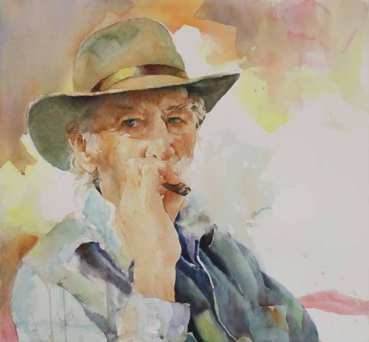
Once I added some real darks to the background, the hat and figure definitely needed more darks/detail, especially in the hand. Also, the smoke appeared flat so that it looked like it was almost on the same plane as his cheek, which wasn’t the case. I popped it forward by darkening his cheek more while still trying to keep some softness in the smoke’s lost edge there.
After I was done building volume with darks, the smoke just didn’t stand out enough anymore, so I went in with another blue-grey glaze out to the right from his stogie, then again a little higher and closer to his face. I kept it light and small with ragged-to-soft edges, leaving most of the smoke already there untouched. I did go into the shirt’s shoulder areas which showed through the smoke and defined them a little more. Again, I worked to keep the edges soft and almost random most of the time. That way, the viewer gets the impression of a darker mass “behind” the smoke that the mind interprets as the shoulder. It is important not to overdo these areas, or you will end up with Swiss cheese instead of smoke.
But he’s not done yet.
Painting over the eyes to deepen shadows is always a gut-twister for me, but the image was still too flat. It lacked the drama I wanted. The only way to fix that was by adding darker values to the face, fingers, hand, and forearm. I chose more of the same warm and cool palette-mixed greys, then added more cadmium red and quinacridone rose (M. Graham) on the paper. This was important here because non-Caucasian people - including those with a strong Native American heritage like this man - have red blood which shows in their warm skin tones, most especially in the cheeks, fingertips, hands and often the shadowed areas of the skin. Leave it out, and they won’t look quite real to the viewer.
Notice how darkening the skin between the smoke and his nose and adding detail to his fingers and stogie pushes the smoke forward in front of him, then back behind his hand, giving it the feeling of puffing outward from his mouth into the air before dissipating. All this without adding any paint to the smoke, itself. And take a look at the top of his ring fingernail. Not darkening it allowed for an essential soft edge among all those hard ones.
At this point, I felt like I “should” paint a light wash around the smoke to cover all that white paper (you know, The Rule About White Paper Near The Paper’s Edges), but everything I thought of doing would have forced me to add more paint elsewhere to balance the change. If I’d wanted a more photorealistic piece, I would have done that, but the mood would have been lost. So forget the rule. I decided I was done.
Main Triad:
Richeson turquoise (Quiller brand)
Permanent orange (Quiller)
Quinacridone violet (M. Graham)
Along with:
Cadmium yellow light (M. Graham)
Cadmium red light (Quiller)
Cadmium red (M. Graham)
Quinacridone rose ( M. Graham)
Pthalocyanine blue (M. Graham)
Ultramarine blue (M. Graham)