5 days - Kate Aubrey, Instructor
People fascinate me. Their moods, their quirks, their private loves. Their feelings large and small. These are the things I strive to capture with paint and brush. Accomplishing this depends upon what is left out at least as much as what is included. In this five day workshop, students will learn how to create a portrait that goes farther than a simple likeness. Come prepared to paint!
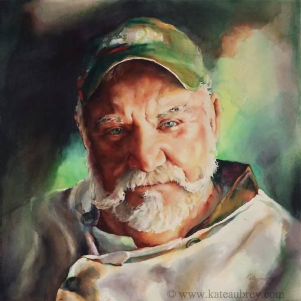
Day 1: Creating a Likeness
Morning: through hands-on, guided exercises and short demos, students will discover the importance of the eyes and how to render, then paint them accurately and sensitively.
Afternoon: we will continue with the nose and mouth.
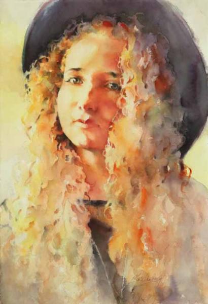
Day 2: Ears, Hair and Incorporating a Background
Morning: working with Day 1’s exercises, students’ questions will be addressed. Students will also learn how to begin incorporating the background into a portrait, often as early as during the first wash.
Afternoon: through hands-on, guided exercises and short demos, students will learn how to render ears and what is needed to recreate interesting, believable hair.
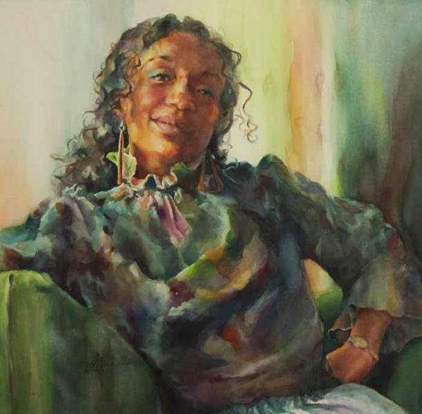
Day 3: Ears, Hair, Backgrounds and Emotions - Setting the Mood
Morning: we will continue with ears, hair and background, including how to tie emotion into both subject and background.
Afternoon: Using a photographic reference (yours or mine) and demonstrations, students will lay out and begin painting a portrait that speaks. Special attention will be given to values and composition.
Days 4 & 5: Painting a Real Person - Likeness and Maintaining Mood
Using a photographic reference (yours or mine) and demonstrations, both full class and individual, students will finish laying out and then paint a portrait that speaks.
Particular attention will be given to brushwork, watercolor techniques ranging the gamut from bold and loose to tight drybrush and when to use each one for heightened emotional impact, as well as how to convey drama through values. Students will put into practice what they have learned about creating believable hair and skin tones while learning to mix harmonious darks and how and where to apply them to help build a solid composition.
PHOTOGRAPHS - Suggestions and Requirements
-
Please be sure the eyes are in focus and anything you want to paint is not blurred, especially eyes or feet if they show.
-
If bringing your own photo to work from, please bring more than one the first day for the sake of choice.
-
Unless you are already an experienced portrait artist, I strongly recommend painting someone you do not know well during the workshop. So does Ted Nuttall. There are important reasons for this.
-
When painting people, shadows are good. Professionally taken photos are lighted so no shadows fall on the subject’s face. This makes them very difficult to paint from, so avoid school photos or magazine-type photos.
-
Teeth are very hard to paint. Please use an unsmiling model unless you are a very experienced portraitist.
-
Real photographic prints on photo paper are massively better to work from than computer printouts. CVS, Walgreens and most Costcos have easy-to-use, relatively inexpensive photo printing systems which will print regularly sized photos and enlargements from the Web, memory cards, smart phones, and tablets. They can also be ordered online and delivered to your home.
-
However, laptops and tablets are even better to work from. Smart phones are not due to the smallness of the image. I will be working from my laptop. Be sure your device is fully charged each day, as outlets are sometimes hard to come by.
SUPPLIES
For the most part, please feel free to use your own colors, brushes, palette, etc. if you wish. I have included a list of what I use for your information, NOT as a required supply list.
That said, please be sure to have the cadmium yellow light by M. Graham or Stephen Quiller Watercolors. Other brands are different colors entirely. Hansa yellow or aureolin may be substituted, but have drawbacks. Hansa yellow, in particular, should be used only if nothing else is available. Please feel free to email me with questions at This email address is being protected from spambots. You need JavaScript enabled to view it..
Flesh tone colors are marked in the list of “What I Use” below. I often add others, but for basic, believable flesh tones, those marked are excellent. Colors for Cauasian tones are marked with an asterisk. Colors for non-Caucasian tones are marked with a tilda.
I will have some extra paints and supplies with me if you can’t find something ahead of time and need to buy them at the workshop.
You can find M. Graham and Quiller paints online at www.jerrysartarama.com if you click on the “See All” button below the ones they list first. Prices are similar at www.dickblick.com, but they only carry the M. Graham watercolors, and you must search for them on the site in order to find them.
And please, check with your local art supply store first when you can. Keeping them in business helps us all, and they can often special order the brands below if they don’t actually carry them.
WHAT I USE
(NOT Required)
Watercolor Paints:
|
Color Name |
Brand |
|
|
* |
Cadmium Yellow Light |
M. Graham or Quiller |
|
~ |
Permanent Orange |
Quiller |
|
Cadmium Red Light |
Quiller |
|
|
* |
Cadmium Red |
M. Graham or Quiller |
|
Quinacridone Rose |
M. Graham |
|
|
~ |
Quinacridone Violet |
M. Graham |
|
Ultramarine Violet |
M. Graham |
|
|
Ultramarine Blue - also good Caucasian color |
M. Graham |
|
|
* |
Pthalocyanine Blue |
M. Graham |
|
~ |
Richeson Turquoise |
Quiller |
|
Richeson Green |
Quiller |
|
|
Permanent Green Light |
M. Graham |
|
|
* |
Cerulean Blue |
M. Graham or Quiller |
|
Naples Yellow - optional |
Quiller |
* Flesh tones for Caucasians
~ Flesh tones for non-Caucasians
Quiller Traveling Palette
Watercolor Brushes:
- Richeson Series 7000 Watermedia (Quiller Brushes)
- Nos. 8, 10, & 12 Rounds - good for portraiture
- 3/4”, 1 1/2”, & 2” Flats
- Carried by www.quillergallery.com and www.jerrysartarama.com online and at many local art stores across the country
- Da Vinci Maestro Rounds ( Tobolski-Kolinski sable)
- Nos. 8, 10, 12, & 14
- Carried by Art Xpress at www.artxpress.com .
- No. 8 is sold as the Mary Whyte brush
- Lovely for figure work, but pricey. Look for them on sale.
Watercolor Paper:
- Saunders Waterford, Arches, or Fabriano Artistico
- Rough or Cold Press, minimum 140#
- Hot Press 260# (Saunders Waterford)
- Hahnemuehle Cezanne (lovely rough surface, 140#)
- Due to recent unacceptable quality control issues in my old, favored brands (above), I have been experimenting with this paper and Hahnemuehle’s extremely rough surfaced Leonardo, 300#. It is a lovely, strong, properly made paper out of Germany that I have thoroughly enjoyed so far.
- If you want a smoother surface, ask Hahnemuehle or your local supplier which one to try. Specify that you want acid free, cotton rag with internal and external sizing (if available) and a minimum weight of 140#.
- I have not yet tried their hot press surface.
Painting Setup:
- Sketch pad - 2 x 12” or 5 x7” for design thumbnails & notes
- Graphite pencils - Prismacolor Turquoise 2B or Durwent HB or equivalent
- Handheld pencil sharpener
- Kneadable eraser
- Mr. Clean Original Magic Erasers
- Mabef or Richeson French Backpacker’s Easel
- Hollow-core drafting board to support watercolor paper (OR Gatorboard, etc.)
- Water containers (I use clear plastic
- Viva original paper towels
- Spray bottle - adjustable from fine spray to a stream (Hobby Lobby)
- Hair dryer
- Plain old 1 1/2” masking tape made by 3M
- Old clothes, smock or apron
- Laptop or iPad/tablet
