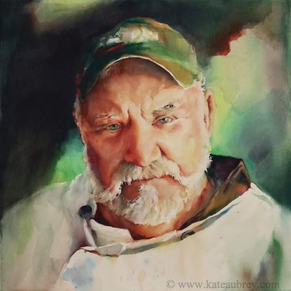
That Look
• 3rd Place - Northwest Watercolor Society 2018 Annual International Juried Exhibition
What is good composition? It’s a tricky question. Not because there is no answer. Not because the answer is so difficult only masters can learn. It’s tricky because asking it implies there is an answer, and if you can just find it, study it, figure it out, it’s gonna be a piece of cake after that. Masterpieces? No problem. You’ll just whip ‘em out…once you know all about composition.
It took me quite a while to figure out that there isn’t an answer. There’s maybe ten million of them. Maybe more. You can memorize and experiment with some basics, like the O composition, or the Z, or the diagonal, or the V, or the hook…. It’s a very long list. Start there, and you’ll learn a lot.
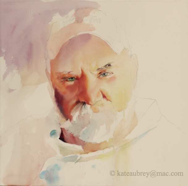
But before you do, lets start with an easy one: a portrait, which is most often presented as a V or pyramid composition. I’ve set up one of my favorite painting subjects in a square format with his eyes (an automatic eye magnet, compositionally) a little north and west of center. The diagonal tilt of his head broke up the space around him in an interesting way that would make his gaze hard to ignore in the finished piece.
It looked good; it felt good. It excited me, so I drew him in and started to paint. So what’s wrong with that?
His eyes are very close to the middle of the painting, and they are the painting’s center of interest. How many times have you been told that’s a problem? Lots.
So how do I get a good composition out of this?
I solve the problem.
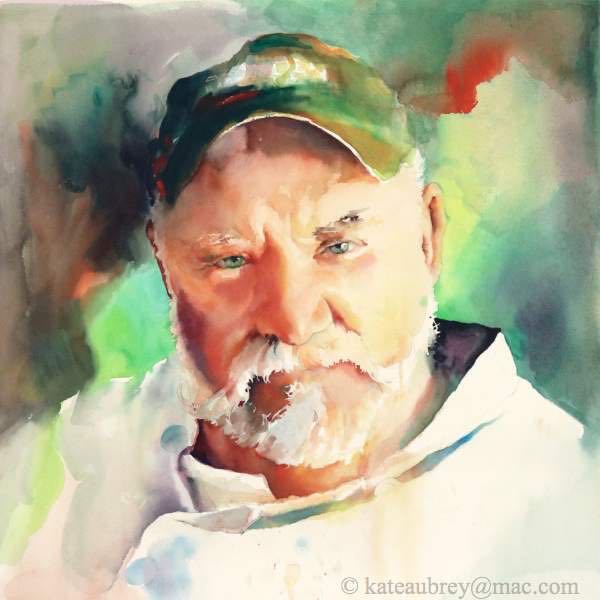
First I got a good handle on Chef Johnny’s features so I could compare everything else—value, relationships, mood—to them. Then I placed my most important darks: his cap and his collar. At the same time, I worked the cap’s darks out into the background and began working there.
Because I’ve done a lot of square-formatted paintings, I already knew that in this one I wanted a light shape extending from one side of the painting, behind his head, and out past his ear on the other side. Once I had decided on green as a main color, I kept it light and exciting, then let the darker background shapes soften into the partially dry light greens. I also joined the background to the figure by allowing it to bleed down into his jacket via its folds and shadows. In contrast, I made his rightmost shoulder line quite hard…for now.
Then I scared myself. My arm felt red to the right of his head…bigtime. I pretty much always listen to my arm when it yells like that, so in it went. Fear struck, so I…did NOT grab my paper towel and blot. I left it there long enough to check and see if I liked it deep down. I did. The red felt right and pointed across to the important orange pop to the left of him, so I left it there and called it a challenge instead of a mistake.
Another thing I left was the dark mustache-hair mark beneath his nose. It’s always tempting to quiet things like that down at this point by blotting, so don’t. Ask yourself if there’s another way you can calm it down. There is, of course, because that side of his face will be in shadow. If I had lightened it up, I would just have had to paint it in again later.
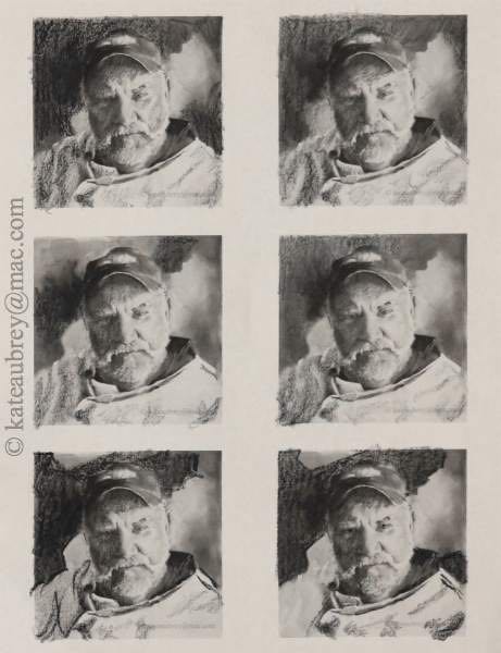
After scaring, then committing myself, I had to face The Problem. It couldn’t be a simple pyramid composition anymore. Even when I have a firm plan (thumbnails and everything), sometimes the painting grabs a hold of my brush. Sometimes it shouts. I’ve learned to listen. Here’s how.
I take a picture of the painting as-is, digitally turn it to black and white (desaturate it), then import it into a blank word processing document. I size it down so I can get at least six images on it, print it out, and play with the shapes using a china marker, grease pencil, or a black crayon. A white crayon can also be useful. While I didn’t actually produce The Perfect Plan here, the bottom two both had elements I liked. Grease pencil isn’t erasable, so I combined the two in my head and went to work.
If you are a newbie to design work and thumbnails, take the time to print out another sheet of images and Get It Right. Or do it by hand, thumbnailing the painting as it stands directly onto your paper. You’ll learn a lot more. Thumbnails are best made small, no larger than 3 x 5”. These are about 2 x 2”. Even better.
In for a penny, in for a pound. I mixed some good, near-blacks and black on my palette and plunged in. Note that both shoulders are softened, the left side more than the right. Variety is a good thing. So is the fact that his cap edge still disappears in places. This is variety of line. You’ll see the same thing in the lower edge of the dark abstract shape.
I let the background shapes, light and dark, seep into his chef’s jacket on the shadow side, leaving only little bits of the shoulder line hard there. I also placed a small, dark triangular shape behind his shoulder on the right. At this point, I could definitely see a hook shape in the darks, and it became even clearer to me what I would do to finish the painting.
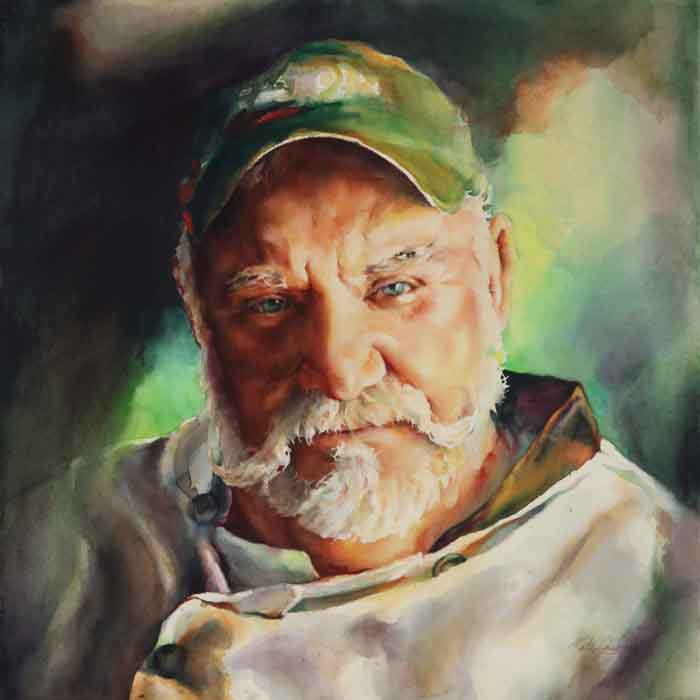
At this point, I focused on bringing the hook shape of the darks around through his jacket without losing the feeling that the jacket is made of white cloth. To accomplish this, I had to add more value to the triangular patch, soften it for variety’s sake, then let it bleed down into the jacket in the lower right corner. Also, you’ll notice that I painted completely over the left-most eye, leaving highlights where they existed. In the end, I lifted a Tiny white fleck out of that eye, something I almost never do, in order to balance the painting. It was the last mark I made on the piece.
So is it a diagonal composition? A hook? A pyramid? I don’t know. More and more, my paintings demand complex, unnameable compositions. The learning never ends. All I can say after years of researching composition is that I listened to the painting and I followed a wonderful piece of advice shared by another painter in the pages of “Watercolor Artist Magazine” several years ago:
I solved the problem.
Main Triad:
Richeson turquoise (Quiller brand)
Permanent orange (Quiller)
Quinacridone violet (M. Graham)
Along with:
Cadmium yellow light (M. Graham)
Cadmium red light (Quiller)
Cadmium red (M. Graham)
Pthalocyanine blue (M. Graham)
Ultramarine blue (M. Graham)
